Reimagining Program Discovery for Millions of Users
Simplilearn — Global Online Learning Platform
Timeline
1 Month (Aug–Sept 2023)
Team
1 PM + 2 Designers
My Role
UX Research and UI Design
Company
Simplilearn
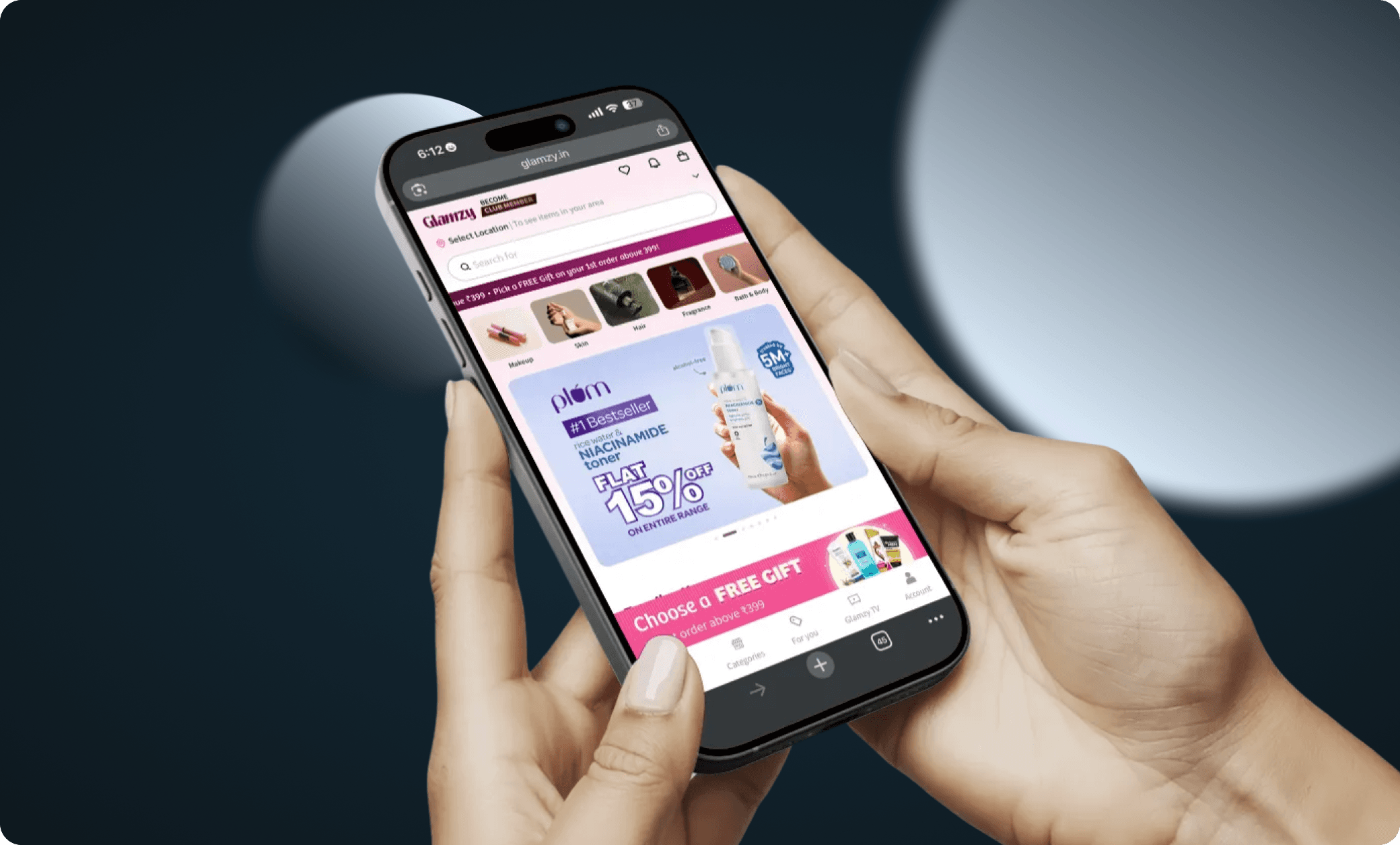
BEFORE

AFTER

01 — Overview
About Simplilearn
Simplilearn is a global online learning platform that helps professionals upskill through industry-relevant certification programs. Serving millions of learners worldwide, Simplilearn partners with top universities and organizations to deliver structured, career-focused learning experiences.
02 — Problem
Problem Statement
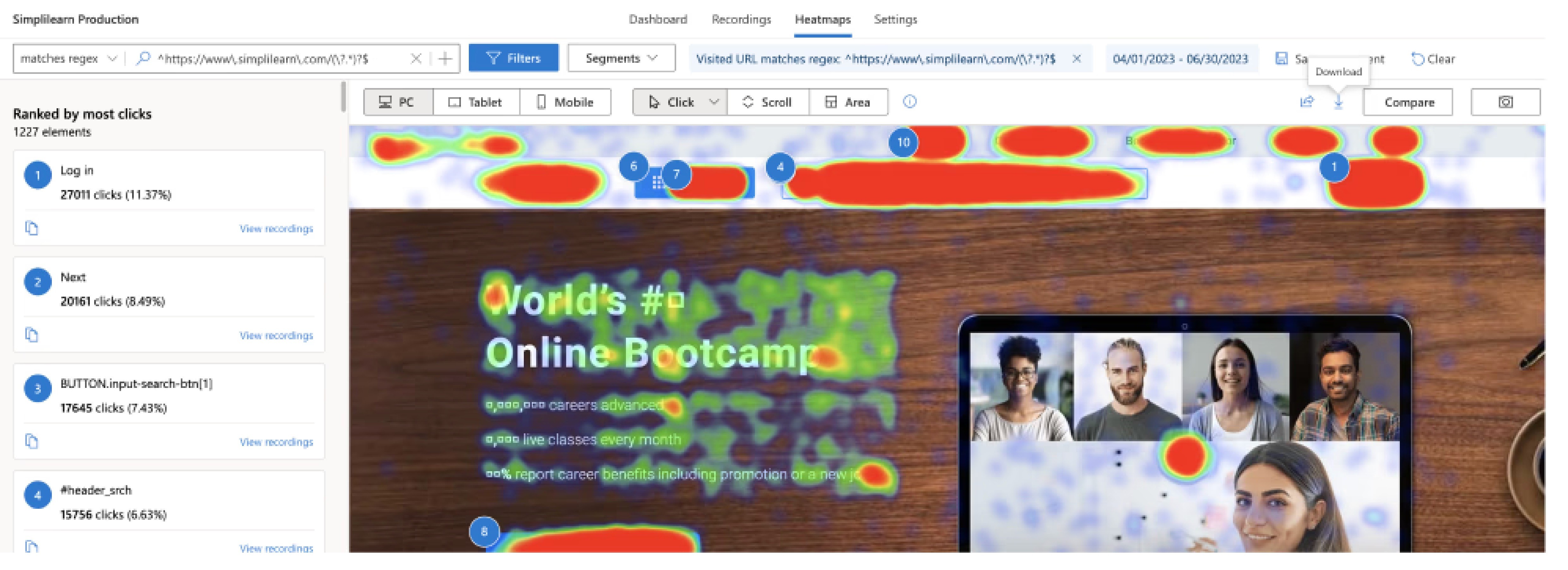
New and organic users landing on the homepage had a 38% bounce rate and only 16% CTR to program pages. Most users were churning without accessing any program.
Hypothesis already set in the room: Homepage is not visually exciting to explore programs and other sections.
1.3M
Users organically landing on homepage every month
38%
New users bouncing without engaging with any programs
16%
Click Through Rate to program pages
UX Goals
1. Reduce bounce rate on homepage
2. Increase user engagement
3. Increase CTR to program page
03 — Research
Primary Research
Before accepting with the hypothesis that was already set, I made sure not to be biased before any research from my end. I started the research by asking 3 core questions :
1. Who are these users coming to Simplilearn?
2. What are they doing on the homepage?
3. What is their main goal or expectation?
Research result
My research revealed that four distinct user segments land on the homepage every month — yet we had just one homepage to address all of their needs. This was not just a visual problem but a expectation mismatch and discoverability problem.
04 — Insights
User Segments
We categorized users into 4 segments based on observed behavior:
Goal Oriented
IT professionals wanting to be industry-ready, get certified, or learn new tech for better profiles and higher pay.
Course Oriented
Looking for specific courses like Cyber Security, Data Science, or AI from Caltech/Purdue/IIT Kanpur
Role Oriented
Want to advance to higher roles like Data Scientist or Project Manager, hence learning specific domains.
Outcome Oriented
Want a specific university certificate (Purdue/IIT Kanpur University)for Cyber Security/Project Manager category

05 — Ideation
How Might We Statements
After researching and segmenting users by their needs, we identified the need to redesign our homepage in a way were each user segment can quickly find what they're looking for — without feeling overwhelmed or having to work to identify relevant content.
The "How Might We" method then guided our brainstorming, helping us generate ideas that effectively serve all user segments.
Program Discovery
How might we make the discovery of programs easier as per the user's mental model?
Relatable Content
How might we make the content relatable and comprehensive for diverse learners?
Build Trust
How might we build better trust to achieve confidence over competitors?
User Stories
How might we deliver user stories to match user needs and expectations?
06 — Solutions
Solutions Implemented
Reframe the Language and visuals that actually resonate and speak to users
The old homepage was too generic and didn't give users a strong enough reason to explore further.
So the first thing we focused on was the language. Instead of leading with numbers and stats — "5k+ careers advanced, 1.5k live classes every month" we shifted toward messaging that speaks to what users actually come looking for: a sense of trust and a clear commitment that this is the right place to grow their career
The visuals got the same treatment. We replaced stock photos with imagery of real professionals in the field so users could actually see themselves in that position.

Designing a discovery experience built around how users think
We simplified how users discover programs by introducing clear categories and filters — so instead of scrolling through 200+ courses with no real direction, users could quickly narrow down to what's actually relevant to them.
Whether someone comes in knowing the exact course they want, chasing a specific career goal, searching by role, or looking for a university-backed program — the experience now works for all four types. Each user finds their own entry point without feeling lost.
Filtering by goal, course, role, or university partner meant users could get to the right program faster — and with more confidence to take the next step.

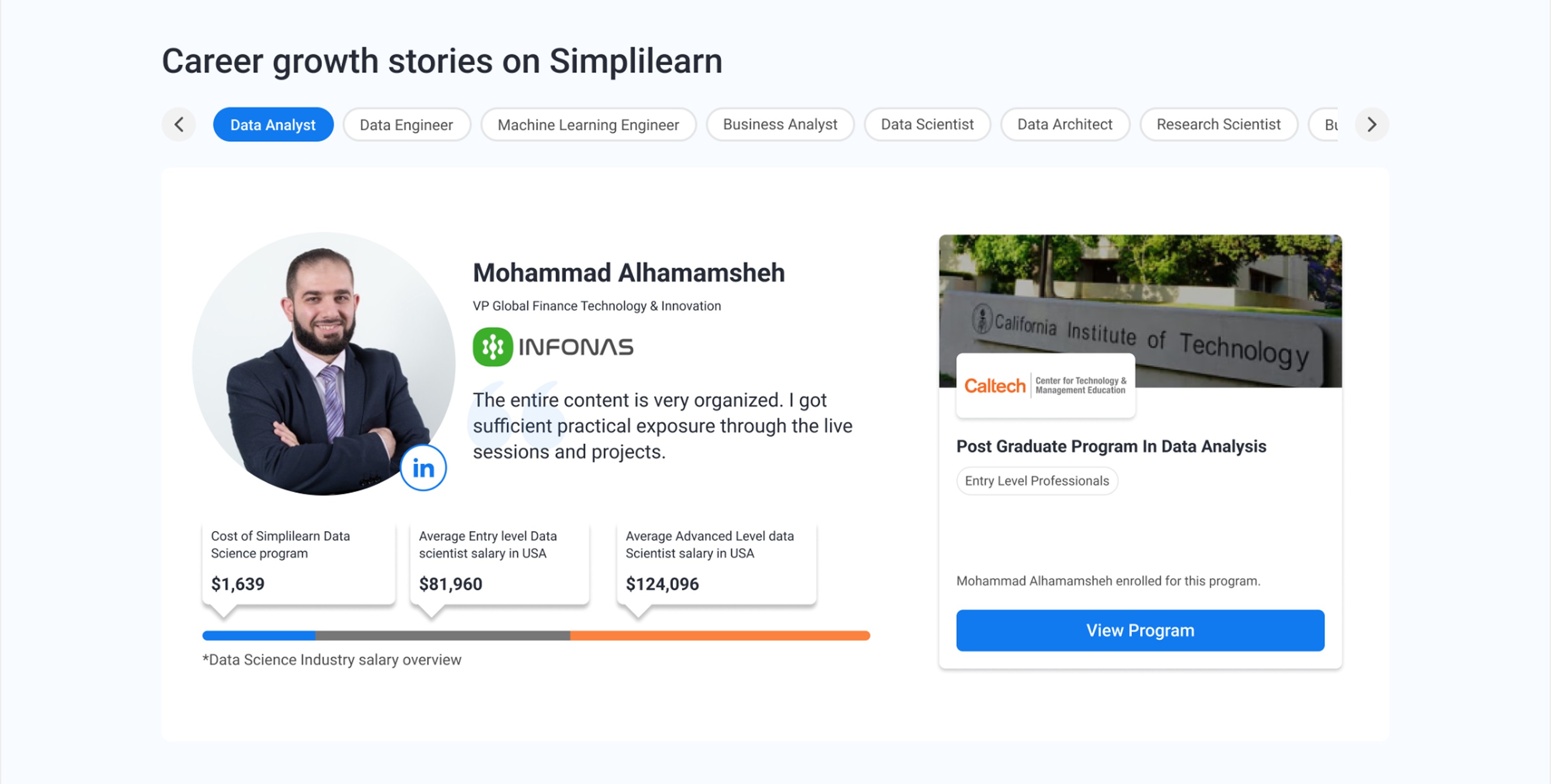
Turning testimonials into stories users can see themselves in
Before committing to any course, most users need to see proof that it actually works. The question they're quietly asking is "has someone in my position done this, and did it actually take them somewhere?"
So instead of generic star ratings and one-liner reviews, we redesigned this section around real stories with a clear structure - where they ended up, what course did they take, and their linkedin profile if a user wants to directly connect with them about the course credibility. We made sure there is complete transparency in out social proof section.
Seeing and reading testimonials like these where "A learner became a Data Science team lead in 8 months" or "IT associate to certified cloud architect" brings the "that could be me" moment which is what builds real trust — and moves them closer to taking action.
GEO-Specific Personalisation
Simplilearn has users across India and beyond and what resonates with someone in Chennai isn't necessarily what resonates with someone in Delhi. A university name carries different weight depending on where you are, and seeing someone from your own city succeed means more than a generic success story.
So we optimised the homepage geo-specific. Users now see programs that are trending in their region, reviews from learners nearby, and university partnerships that are relevant to where they are. It's a relatively small change, but it makes the homepage feel like it was built for you, not just for everyone.
07 — Results
Initial Results
+24%
+17%
We saw a huge amount of users interacting with the homepage and finding their way to Program pages. Homepage was not an entry point for all the different type of user needs.
08 — Learning
What this project taught me
The biggest lesson this project gave me was to never get carried away by assumptions, no matter how many people have backed them before the work reaches you. Start from scratch. Do your own research. Form your own point of view.
Because research has a way of completely reframing the problem. What started as "how do we make this page more visually engaging" turned into something far more interesting "how do we design one page that works for four completely different types of users?" Those are very different questions, and they lead to very different solutions.
The second thing I took away is that designing a homepage for a product like Simplilearn is genuinely harder than it looks. You're not designing for one user. You're designing for multiple user types, across multiple regions, each with their own expectations, motivations, and decision-making triggers.
The real challenge isn't creating one great page. It's creating one page that feels like the right page to every single person who lands on it. That's a different kind of problem and honestly, exactly the kind I enjoy solving.